

In early 2009, Tropicana, one of the most recognized juice brands in the U.S., made a bold move. They redesigned the packaging of their best-selling product, Tropicana Pure Premium orange juice. The goal was to give the brand a fresh and modern look.
But the change didn’t land well with shoppers. Instead of praise, the new look sparked confusion, frustration, and criticism. Within just a few weeks, Tropicana was forced to return to the original design.
This is now known as one of the most talked-about packaging failures in branding. It shows how easy it is to lose touch with what people really value — and what marketers can learn from it.
About Tropicana
Tropicana started in 1947 when Anthony Rossi began delivering fresh orange juice to customers in Florida. His innovation in pasteurizing juice helped the brand grow rapidly. By the 1950s, Tropicana was delivering fresh juice across the U.S.
In 1998, PepsiCo acquired Tropicana. By 2009, Tropicana was leading the premium juice market in the U.S., with over $700 million in yearly sales. It had become a part of people’s morning routines and a household favorite.
What Was the Idea Behind the Change?
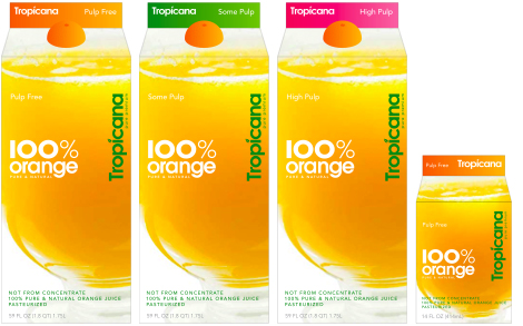
Tropicana wanted to modernize the brand. They hired the design agency Arnell to lead the refresh. The agency’s vision was to simplify and update the look of the juice carton by focusing more on the product inside rather than the fruit itself.
The new packaging showed a plain glass of orange juice instead of the familiar orange with a straw. The lid was redesigned to look like half an orange. The logo was changed too — it became vertical, slimmer, and less bold.
The company believed this sleek, minimalist look would feel fresh and contemporary. They also launched an advertising campaign to support the change.
What Actually Happened?
The new packaging was launched in stores on January 8, 2009. But the response was not what Tropicana expected. Customers were confused. Some couldn’t find their favorite juice on the shelf. Others didn’t like the new look and felt it looked cheap or generic.
Sales fell by 20 percent in just two months, costing the company about $30 million. Competitors gained market share, and Tropicana’s reputation took a hit. By late February, the company announced it would return to the original packaging, and within a few months, it was back on store shelves.
The entire rebranding effort, including design, advertising, and the loss in sales, cost the company over $50 million.
Differences Between the Original Packaging and the New One
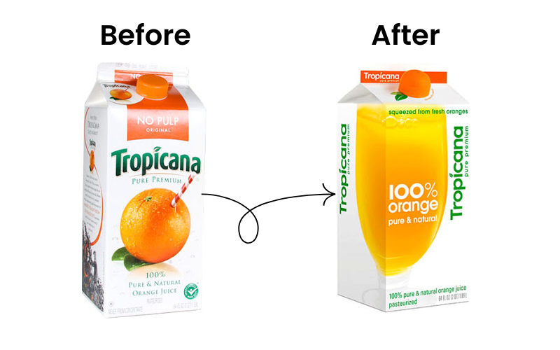
The Front Image
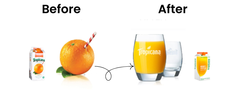
The original design featured a vibrant orange with a straw in it — a clever and now iconic visual that told customers it was fresh-squeezed orange juice. The new design replaced that with a glass of juice. It looked generic and lost the charm that made it recognizable on shelves.
The Lid
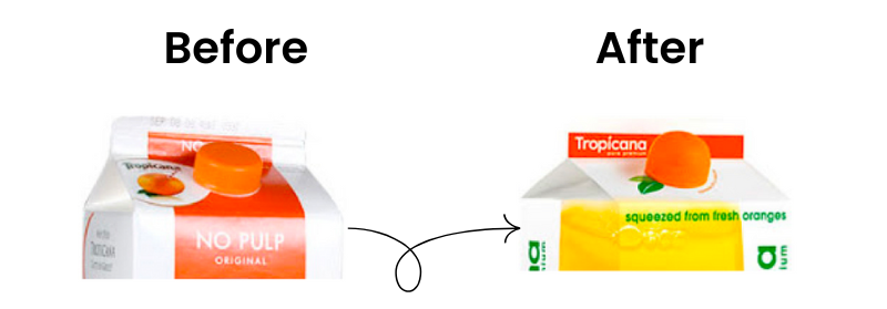
The original cap was a simple, flat orange lid. The new one was shaped and textured like half an orange. It was creative, but it didn’t have much impact because most customers were already put off by the rest of the redesign.
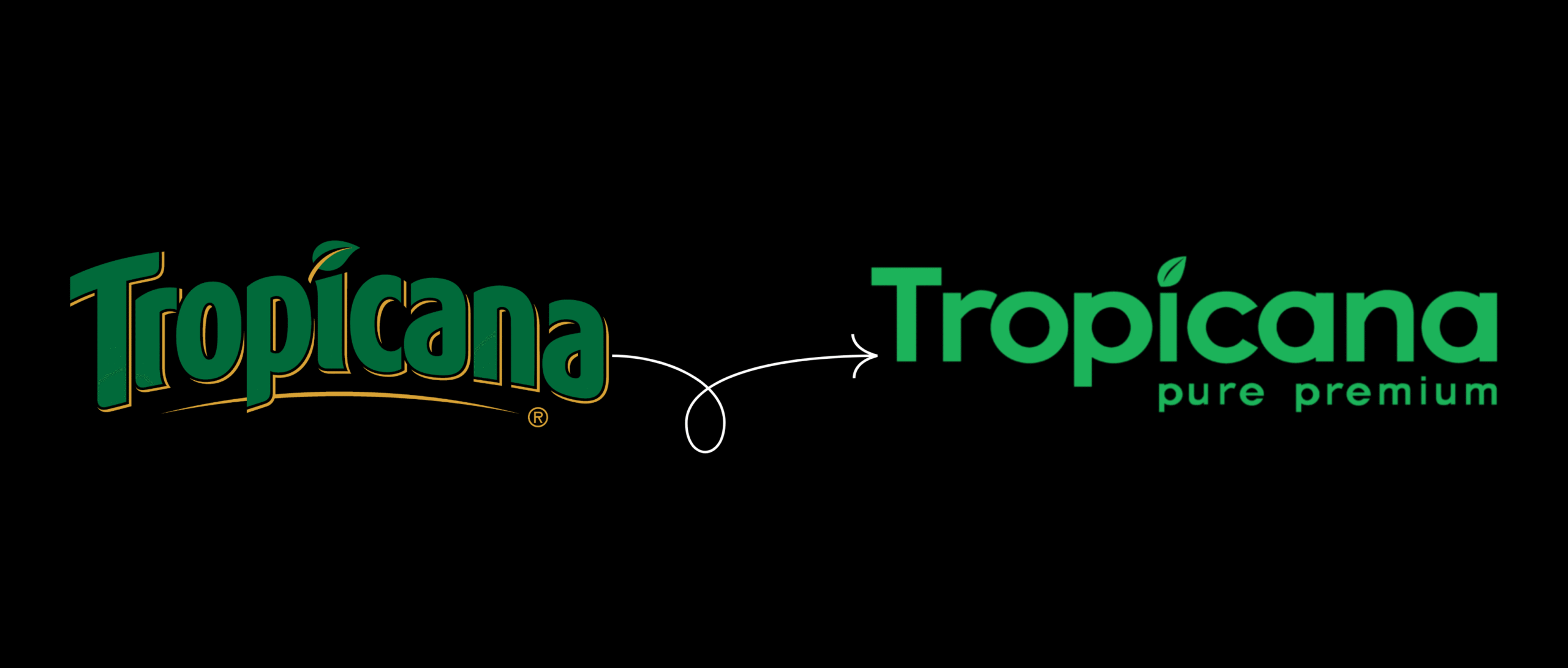
The Logo
![]()
The original logo was horizontal, bold, and easy to spot. It featured the words “Tropicana Pure Premium.” The new logo was vertical, thinner, and smaller. The “Pure Premium” tagline was replaced by “100% Orange Pure and Natural.” The logo became harder to see and lost its shelf impact.
The Overall Feel
The new packaging was stripped-down and minimal. While that might work in some categories, many customers felt it made Tropicana look like a cheaper, generic brand rather than a trusted premium one.
The Advertising Campaign That Was Released With the New Packaging Design
Tropicana didn’t just change the packaging. They backed it with a full advertising campaign.
The campaign’s main message was “Squeeze, it’s a natural.” The idea was to focus on the functional benefits of orange juice — that it was a natural, healthy part of your diet — while also connecting emotionally with the idea of freshness.
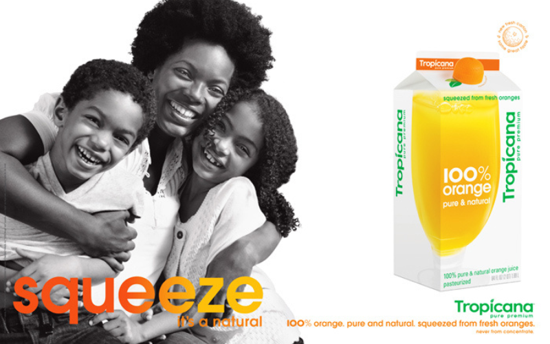
TV commercials, print ads, and in-store displays all used this line. The visuals featured juice being squeezed, reinforcing the new lid’s design and the theme of freshness. Tropicana wanted the campaign to show that this juice was both essential and emotionally satisfying.
While the campaign was aligned with the packaging design, it couldn’t overcome the confusion customers felt when they saw the new carton on the shelf.
What Went Wrong?
Customers Felt Disconnected
The new packaging removed all the visual cues that people trusted. Without the orange with the straw, many didn’t recognize the product. The emotional connection they had to the old design was lost.
It Looked Like a Cheap Brand
Instead of coming across as premium, the new look felt plain and ordinary. It didn’t reflect the quality people had come to expect from Tropicana.
Too Many Changes at Once
Tropicana didn’t just tweak a few things — they changed the logo, the lid, the image, the typography, and the product message all at once. That overwhelmed people and caused confusion.
What We Can Learn From This
1. Packaging Is Not Just Decoration
It plays a major role in brand recognition and customer trust. Change it too much, and you risk making your product unrecognizable.
2. People Buy With Emotion
Even in something as basic as orange juice, people form emotional connections. When you take away the visual identity they associate with comfort and quality, they feel let down.
3. Make Changes Gradually
If you need to modernize your brand, do it step by step. Small, thoughtful updates are easier for customers to accept.
4. Keep Packaging and Advertising Goals Clear
Advertising can tell a deeper story, but packaging has to work in seconds. The same emotional story that works in a commercial may not work when a customer is scanning a store shelf.
5. Always Think Like the Customer
Ask yourself, “Would I recognize this if I saw it from across the aisle?” Tropicana forgot to ask that question, and it cost them millions.
Final Thoughts
Tropicana’s packaging redesign wasn’t just a design issue it was a lesson in how branding works in real life. People rely on visual cues, habits, and emotions when they make buying decisions. When brands take those things away too quickly or without warning, even the most loyal customers might walk away.
This case is a reminder that every detail in your brand, especially packaging matters more than you think. It’s not just about how something looks. It’s about how it makes people feel.
If you’re planning a rebrand or packaging change, this story shows why you need to tread carefully. Get input from customers, test small changes, and never underestimate the value of what people already love.
Comments are closed